

Brand guidelines
This guide defines the visual language, design style, and principles that shape a clear and consistent brand experience, no matter the team or area of expertise.
At its core, Create Ape™ is about precision and clarity—just like our mission to deliver measurable impact for businesses in healthcare. This guide lays out the essential design standards that bring our brand to life, from our color system and typography to accessibility benchmarks and documentation.
Whether you're designing for digital platforms or printed materials, these guidelines ensure every touchpoint reflects the trust and efficiency at the heart of Create Ape™.
Contents
01
Brand strategy
02
Personality
03
Logo
04
Color
05
Typography
01
Brand strategy
In healthtech, complexity compounds.
Regulatory constraints, technical debt, internal silos, shifting stakeholder priorities — left unchecked, they slow momentum and dilute impact. Products don’t fail because the ideas aren’t strong. They fail because execution drifts from clarity.
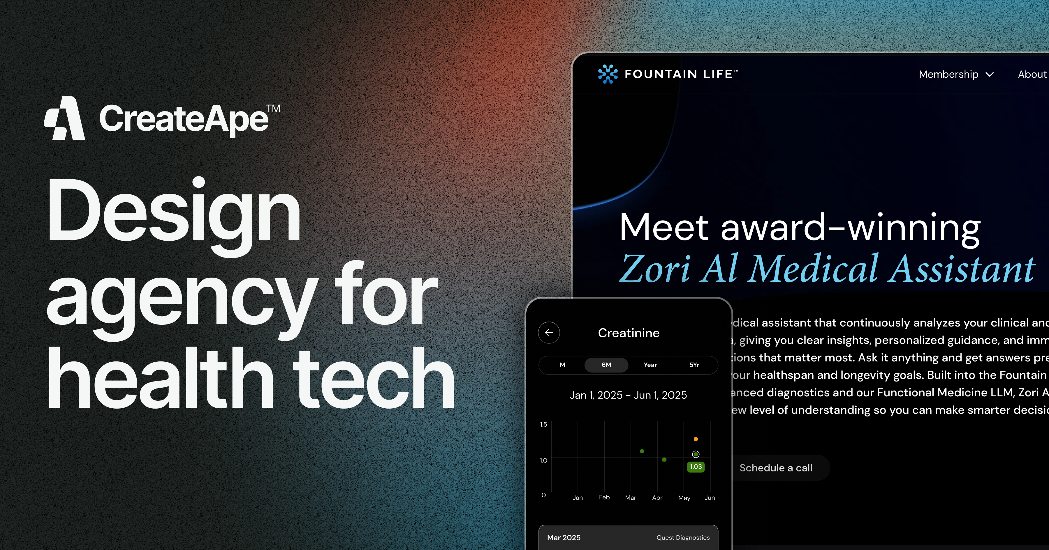
Create Ape™ restores alignment between vision and experience. We were built to help health tech and enterprise teams move from breakthrough concepts to intuitive, high-performance digital products.
Our mission is simple: translate complexity into clarity — and do it with speed, precision, and intent.
Through rigorous discovery, strategic UX frameworks, and disciplined design execution, we uncover friction, eliminate noise, and build systems that scale. Every decision is rooted in user behavior, business objectives, and measurable outcomes.
We don’t just make products look better.
We make them work better — for users, for teams, and for growth. Because when strategy is tight and execution is sharp, momentum follows.
02
Personality
Create Ape™ has the personality of a sharp, reliable partner — equal parts strategic and grounded. We’re driven by results, thoughtful in our approach, and trusted for our consistency. There's no ego in how we show up — just clarity, focus, and execution. We move fast, think deeply, and communicate like a senior team that knows what matters: aligning with your goals, solving complex problems, and delivering outcomes that will last.
Strategic
Precise
Reliable
Approachable
1a
Tone & voice
Confident
We know what we’re doing — avoid hedging or filler. Write with clarity and authority.
Strategic
Everything should ladder up to user impact and business outcomes. Always write with purpose.
Collaborative
We’re partners, not vendors. Use inclusive language (“we,” “together,” “aligned”).
Modern
Use clean, up-to-date language. Avoid dated buzzwords or overly technical jargon.
Human
Be smart, but not stiff. Use active voice, keep it natural, and avoid sounding robotic.
1b
Sample copy
Something off? We’ll get it back on track
Seeing friction in your product? Hearing noise from users or internal teams? We’ll dig in, pinpoint the gaps, and design solutions that remove roadblocks—without disrupting your momentum.
Complexity doesn’t scare us—it drives us
Whether it’s legacy tech, clinical workflows, or multi-stakeholder systems, we thrive in complex environments. We bring clarity, structure, and speed—and we’re not afraid to ask the hard questions.
You stay focused, we drive the momentum
Your team’s time is too valuable to spend wrangling design revisions or misaligned vendors. We embed quickly, align fast, and handle the heavy lifting — so you can focus on what moves the needle.
Precision design, built for outcomes
Small UX issues can create big problems — from user drop-off to compliance risk. That’s why our work isn’t just polished — it’s purposeful, strategic, and aligned with business goals.
03
Logo
The Create Ape logo combines a clean, modern wordmark with a unique brandmark that visually captures the essence of the brand. The brandmark is an abstract representation of the letters "C" and "A," carefully designed to form a bold, cohesive symbol.
The main version of the logo is the horizontal lockup, which combines the brandmark and wordmark and should always be the preferred choice when space allows. However, in cases where space is limited or specific design needs arise, the vertical lockup can be used. For minimal space scenarios, such as social media icons or favicons, the brandmark alone is recommended to ensure quick recognition and maintain versatility while preserving brand consistency across all applications.
3a
Primary lockup

3b
Clearspace


Screen | 24 pixels height


Print | 0.12 inches height


3c
Secondary

3d
Incorrect usage


Do not resize the mark

Do not rotate the logo


Do not change the color of the logo


Do not outline the logo

Do not change the logo proportions

CreateApe
Do not change the typography of the logo
Do not add effects to the logo


Do not reverse the lockup


Do not add gradients the logo
3e
Partnerships

04
Color
Create Ape’s color palette is designed to evoke trust, modernity, and professionalism, ensuring that every touchpoint reflects our commitment to accuracy and efficiency.
Together, these colors create a strong, dependable, and forward-thinking brand identity, ensuring that Create Ape is instantly recognized as the go-to solution for digital healthcare design.
4a
Primary palette
Offset Green
Hex: #202623
CMYK: 16%, 0%, 8%, 85%
RGB: 32, 38, 35
Bone White
Hex: #F5F7F6
CMYK: 1%, 0%, 0%, 3%
RGB: 245, 247, 246
4b
Accents
Orange
Hex: #FA4616
PMS 172C
CMYK: 0%, 72%, 91%, 2%
RGB: 250, 70, 22
Green
Hex: #97D700
PMS 375C
CMYK: 30%, 0%, 100%, 16%
RGB: 151, 215, 0
4c
Color tints
Tint 1
Hex: #4B504D
CMYK: 6%, 0%, 4%, 69%
RGB: 70, 80, 77
Tint 2
Hex: #787E7A
CMYK: 5%, 0%, 3%, 51%
RGB: 120, 126, 122
Tint 3
Hex: #A0A4A2
CMYK: 2%, 0%, 1%, 36%
RGB: 160, 164, 162
Tint 4
Hex: #E0E2E1
CMYK: 1%, 0%, 0%, 11%
RGB: 224, 226, 225
Tint 5
Hex: #EAEDEB
CMYK: 1%, 0%, 1%, 7 &
RGB: 234, 237, 235
4d
Logo colors


4e
Gradient palette


Gradient 1

Gradient 2


Gradient 3


Gradient 4
05
Typography
The Create Ape brand uses the Inter typeface, a modern and versatile font designed for readability and clarity across digital and print mediums.


Aa
The primary weights used are Semibold (Inter Semibold) and Medium (Inter Medium), striking a balance between emphasis and simplicity.
Semibold is typically reserved for headlines, subheadings, or elements that require greater attention, while Regular is used for body text, ensuring legibility and a clean, professional look.
Together, these weights maintain a consistent and approachable tone, aligning seamlessly with the brand's visual identity.
5b
Sizing
Type scale defines hierarchy and presence. Headings command attention with confident proportion, while body copy remains refined and highly legible. Clear size contrast is essential—each level must feel intentional, balanced, and distinctly prioritized.
Heading 1
Type Sizes > 100pt/px
100% Leading
-5% Tracking
Heading 2
Type Sizes 50–100pt/px
100% Leading
-5% Tracking
Heading 3
Type Sizes 40–55pt/px
60% Leading
-5% Tracking
Heading 4
Type Sizes 35–40pt/px
40% Leading
-5% Tracking
Heading 5
Type Sizes 20–25pt/px
-5% Tracking
Heading 6
Type Sizes 18–20pt/px
-5% Tracking
Paragraph lorem ipsum dolor sit amet, consectetur adipiscing elit, sed do eiusmod tempor incididunt ut labore et dolore magna aliqua. Ut enim ad minim veniam, quis nostrud exercitation ullamco laboris nisi ut aliquip ex ea commodo consequat.
Type Sizes 0–18pt/px
150% Leading
0% Tracking

All Rights Reserved
Brand guidelines
This guide defines the visual language, design style, and principles that shape a clear and consistent brand experience, no matter the team or area of expertise.
At its core, Create Ape™ is about precision and clarity—just like our mission to deliver measurable impact for businesses in healthcare. This guide lays out the essential design standards that bring our brand to life, from our color system and typography to accessibility benchmarks and documentation.
Whether you're designing for digital platforms or printed materials, these guidelines ensure every touchpoint reflects the trust and efficiency at the heart of Create Ape™.
Contents
01
Brand strategy
02
Personality
03
Logo
04
Color
05
Typography
01
Brand strategy
In healthtech, complexity compounds.
Regulatory constraints, technical debt, internal silos, shifting stakeholder priorities — left unchecked, they slow momentum and dilute impact. Products don’t fail because the ideas aren’t strong. They fail because execution drifts from clarity.
Create Ape™ restores alignment between vision and experience. We were built to help health tech and enterprise teams move from breakthrough concepts to intuitive, high-performance digital products.
Our mission is simple: translate complexity into clarity — and do it with speed, precision, and intent.
Through rigorous discovery, strategic UX frameworks, and disciplined design execution, we uncover friction, eliminate noise, and build systems that scale. Every decision is rooted in user behavior, business objectives, and measurable outcomes.
We don’t just make products look better.
We make them work better — for users, for teams, and for growth. Because when strategy is tight and execution is sharp, momentum follows.
02
Personality
Create Ape™ has the personality of a sharp, reliable partner — equal parts strategic and grounded. We’re driven by results, thoughtful in our approach, and trusted for our consistency. There's no ego in how we show up — just clarity, focus, and execution. We move fast, think deeply, and communicate like a senior team that knows what matters: aligning with your goals, solving complex problems, and delivering outcomes that will last.
Strategic
Precise
Reliable
Approachable
1a
Tone & voice
Confident
We know what we’re doing — avoid hedging or filler. Write with clarity and authority.
Strategic
Everything should ladder up to user impact and business outcomes. Always write with purpose.
Collaborative
We’re partners, not vendors. Use inclusive language (“we,” “together,” “aligned”).
Modern
Use clean, up-to-date language. Avoid dated buzzwords or overly technical jargon.
Human
Be smart, but not stiff. Use active voice, keep it natural, and avoid sounding robotic.
1b
Sample copy
Precision design, built for outcomes
Small UX issues can create big problems — from user drop-off to compliance risk. That’s why our work isn’t just polished — it’s purposeful, strategic, and aligned with business goals.
You stay focused, we drive the momentum
Your team’s time is too valuable to spend wrangling design revisions or misaligned vendors. We embed quickly, align fast, and handle the heavy lifting — so you can focus on what moves the needle.
Complexity doesn’t scare us—it drives us
Whether it’s legacy tech, clinical workflows, or multi-stakeholder systems, we thrive in complex environments. We bring clarity, structure, and speed—and we’re not afraid to ask the hard questions.
Something off? We’ll get it back on track
Seeing friction in your product? Hearing noise from users or internal teams? We’ll dig in, pinpoint the gaps, and design solutions that remove roadblocks—without disrupting your momentum.
03
Logo
The Create Ape logo combines a clean, modern wordmark with a unique brandmark that visually captures the essence of the brand. The brandmark is an abstract representation of the letters "C" and "A," carefully designed to form a bold, cohesive symbol.
The main version of the logo is the horizontal lockup, which combines the brandmark and wordmark and should always be the preferred choice when space allows. However, in cases where space is limited or specific design needs arise, the vertical lockup can be used. For minimal space scenarios, such as social media icons or favicons, the brandmark alone is recommended to ensure quick recognition and maintain versatility while preserving brand consistency across all applications.
3a
Primary lockup

3b
Clearspace


Screen | 24 pixels height


Print | 0.12 inches height


3c
Secondary lockups

3d
Incorrect usage

Do not resize the mark

Do not rotate the logo

Do not change the color of the logo


Do not outline the logo

Do not change the logo proportions

CreateApe
Do not change the typography of the logo
Do not add effects to the logo

Do not reverse the lockup


Do not add gradients the logo
3e
Partnerships

04
Color
Create Ape’s color palette is designed to evoke trust, modernity, and professionalism, ensuring that every touchpoint reflects our commitment to accuracy and efficiency.
Together, these colors create a strong, dependable, and forward-thinking brand identity, ensuring that Create Ape is instantly recognized as the go-to solution for digital healthcare design.
4a
Primary palette
Offset Green
Hex: #202623
CMYK: 16%, 0%, 8%, 85%
RGB: 32, 38, 35
Bone White
Hex: #F5F7F6
CMYK: 1%, 0%, 0%, 3%
RGB: 245, 247, 246
4b
Accents
Orange
Hex: #FA4616
PMS 172C
CMYK: 0%, 72%, 91%, 2%
RGB: 250, 70, 22
Green
Hex: #97D700
PMS 375C
CMYK: 30%, 0%, 100%, 16%
RGB: 151, 215, 0
4c
Color tints
Tint 1
Hex: #4B504D
CMYK: 6%, 0%, 4%, 69%
RGB: 70, 80, 77
Tint 2
Hex: #787E7A
CMYK: 5%, 0%, 3%, 51%
RGB: 120, 126, 122
Tint 3
Hex: #A0A4A2
CMYK: 2%, 0%, 1%, 36%
RGB: 160, 164, 162
Tint 4
Hex: #E0E2E1
CMYK: 1%, 0%, 0%, 11%
RGB: 224, 226, 225
Tint 5
Hex: #EAEDEB
CMYK: 1%, 0%, 1%, 7 &
RGB: 234, 237, 235
4d
Logo colors


4e
Gradient palette
Gradient 1
Gradient 2
Gradient 3
Gradient 4
05
Typography
The Create Ape brand uses the Inter typeface, a modern and versatile font designed for readability and clarity across digital and print mediums.


Aa
The primary weights used are Semibold (Inter Semibold) and Medium (Inter Medium), striking a balance between emphasis and simplicity.
Semibold is typically reserved for headlines, subheadings, or elements that require greater attention, while Regular is used for body text, ensuring legibility and a clean, professional look.
Together, these weights maintain a consistent and approachable tone, aligning seamlessly with the brand's visual identity.
Heading 1
Type Sizes > 100pt/px
100% Leading
-5% Tracking
Heading 2
Type Sizes 50–100pt/px
100% Leading
-5% Tracking
Heading 3
Type Sizes 40–55pt/px
60% Leading
-5% Tracking
Heading 4
Type Sizes 35–40pt/px
40% Leading
-5% Tracking
Heading 5
Type Sizes 20–25pt/px
-5% Tracking
Heading 6
Type Sizes 18–20pt/px
-5% Tracking
Paragraph lorem ipsum dolor sit amet, consectetur adipiscing elit, sed do eiusmod tempor incididunt ut labore et dolore magna aliqua. Ut enim ad minim veniam, quis nostrud exercitation ullamco laboris nisi ut aliquip ex ea commodo consequat.
Type Sizes 0–18pt/px
150% Leading
0% Tracking
5b
Sizing
Type scale defines hierarchy and presence. Headings command attention with confident proportion, while body copy remains refined and highly legible. Clear size contrast is essential—each level must feel intentional, balanced, and distinctly prioritized.

All Rights Reserved
Brand guidelines
This guide defines the visual language, design style, and principles that shape a clear and consistent brand experience, no matter the team or area of expertise.
At its core, Create Ape™ is about precision and clarity—just like our mission to deliver measurable impact for businesses in healthcare. This guide lays out the essential design standards that bring our brand to life, from our color system and typography to accessibility benchmarks and documentation.
Whether you're designing for digital platforms or printed materials, these guidelines ensure every touchpoint reflects the trust and efficiency at the heart of Create Ape™.
Contents
01
Brand strategy
02
Personality
03
Logo
04
Color
05
Typography
01
Brand strategy
In healthtech, complexity compounds.
Regulatory constraints, technical debt, internal silos, shifting stakeholder priorities — left unchecked, they slow momentum and dilute impact. Products don’t fail because the ideas aren’t strong. They fail because execution drifts from clarity.
Create Ape™ restores alignment between vision and experience. We were built to help health tech and enterprise teams move from breakthrough concepts to intuitive, high-performance digital products.
Our mission is simple: translate complexity into clarity — and do it with speed, precision, and intent.
Through rigorous discovery, strategic UX frameworks, and disciplined design execution, we uncover friction, eliminate noise, and build systems that scale. Every decision is rooted in user behavior, business objectives, and measurable outcomes.
We don’t just make products look better.
We make them work better — for users, for teams, and for growth. Because when strategy is tight and execution is sharp, momentum follows.
02
Personality
Create Ape™ has the personality of a sharp, reliable partner — equal parts strategic and grounded. We’re driven by results, thoughtful in our approach, and trusted for our consistency. There's no ego in how we show up — just clarity, focus, and execution. We move fast, think deeply, and communicate like a senior team that knows what matters: aligning with your goals, solving complex problems, and delivering outcomes that will last.
Strategic
Precise
Reliable
Approachable
1a
Tone & voice
Confident
We know what we’re doing — avoid hedging or filler. Write with clarity and authority.
Strategic
Everything should ladder up to user impact and business outcomes. Always write with purpose.
Collaborative
We’re partners, not vendors. Use inclusive language (“we,” “together,” “aligned”).
Modern
Use clean, up-to-date language. Avoid dated buzzwords or overly technical jargon.
Human
Be smart, but not stiff. Use active voice, keep it natural, and avoid sounding robotic.
1b
Sample copy
Precision design, built for outcomes
Small UX issues can create big problems — from user drop-off to compliance risk. That’s why our work isn’t just polished — it’s purposeful, strategic, and aligned with business goals.
You stay focused, we drive the momentum
Your team’s time is too valuable to spend wrangling design revisions or misaligned vendors. We embed quickly, align fast, and handle the heavy lifting — so you can focus on what moves the needle.
Complexity doesn’t scare us—it drives us
Whether it’s legacy tech, clinical workflows, or multi-stakeholder systems, we thrive in complex environments. We bring clarity, structure, and speed—and we’re not afraid to ask the hard questions.
Something off? We’ll get it back on track
Seeing friction in your product? Hearing noise from users or internal teams? We’ll dig in, pinpoint the gaps, and design solutions that remove roadblocks—without disrupting your momentum.
03
Logo
The Create Ape logo combines a clean, modern wordmark with a unique brandmark that visually captures the essence of the brand. The brandmark is an abstract representation of the letters "C" and "A," carefully designed to form a bold, cohesive symbol.
The main version of the logo is the horizontal lockup, which combines the brandmark and wordmark and should always be the preferred choice when space allows. However, in cases where space is limited or specific design needs arise, the vertical lockup can be used. For minimal space scenarios, such as social media icons or favicons, the brandmark alone is recommended to ensure quick recognition and maintain versatility while preserving brand consistency across all applications.
3a
Primary lockup

3b
Clearspace


Screen | 24 pixels height

Print | 0.12 inches height
3c
Secondary lockups

3d
Incorrect usage

Do not resize the mark

Do not rotate the logo


Do not change the color of the logo

Do not outline the logo

Do not change the logo proportions

CreateApe
Do not change the typography of the logo
Do not add effects to the logo

Do not reverse the lockup

Do not add gradients the logo
3e
Partnerships
04
Color
Create Ape’s color palette is designed to evoke trust, modernity, and professionalism, ensuring that every touchpoint reflects our commitment to accuracy and efficiency.
Together, these colors create a strong, dependable, and forward-thinking brand identity, ensuring that Create Ape is instantly recognized as the go-to solution for digital healthcare design.
4a
Primary palette
Offset Green
Hex: #202623
CMYK: 16%, 0%, 8%, 85%
RGB: 32, 38, 35
Bone White
Hex: #F5F7F6
CMYK: 1%, 0%, 0%, 3%
RGB: 245, 247, 246
4b
Accents
Orange
Hex: #FA4616
PMS 172C
CMYK: 0%, 72%, 91%, 2%
RGB: 250, 70, 22
Green
Hex: #97D700
PMS 375C
CMYK: 30%, 0%, 100%, 16%
RGB: 151, 215, 0
4c
Color tints
Tint 1
Hex: #4B504D
CMYK: 6%, 0%, 4%, 69%
RGB: 70, 80, 77
Tint 2
Hex: #787E7A
CMYK: 5%, 0%, 3%, 51%
RGB: 120, 126, 122
Tint 3
Hex: #A0A4A2
CMYK: 2%, 0%, 1%, 36%
RGB: 160, 164, 162
Tint 4
Hex: #E0E2E1
CMYK: 1%, 0%, 0%, 11%
RGB: 224, 226, 225
Tint 5
Hex: #EAEDEB
CMYK: 1%, 0%, 1%, 7 &
RGB: 234, 237, 235
4d
Logo colors


4e
Gradient palette
Gradient 1
Gradient 2

Gradient 3
Gradient 4
05
Typography
The Create Ape brand uses the Inter typeface, a modern and versatile font designed for readability and clarity across digital and print mediums.


Aa
The primary weights used are Semibold (Inter Semibold) and Medium (Inter Medium), striking a balance between emphasis and simplicity.
Semibold is typically reserved for headlines, subheadings, or elements that require greater attention, while Regular is used for body text, ensuring legibility and a clean, professional look.
Together, these weights maintain a consistent and approachable tone, aligning seamlessly with the brand's visual identity.
5b
Sizing
Type scale defines hierarchy and presence. Headings command attention with confident proportion, while body copy remains refined and highly legible. Clear size contrast is essential—each level must feel intentional, balanced, and distinctly prioritized.
Heading 1
Type Sizes > 100pt/px
100% Leading
-5% Tracking
Heading 2
Type Sizes 50–100pt/px
100% Leading
-5% Tracking
Heading 3
Type Sizes 40–55pt/px
60% Leading
-5% Tracking
Heading 4
Type Sizes 35–40pt/px
40% Leading
-5% Tracking
Heading 5
Type Sizes 20–25pt/px
-5% Tracking
Heading 6
Type Sizes 18–20pt/px
-5% Tracking
Paragraph lorem ipsum dolor sit amet, consectetur adipiscing elit, sed do eiusmod tempor incididunt ut labore et dolore magna aliqua. Ut enim ad minim veniam, quis nostrud exercitation ullamco laboris nisi ut aliquip ex ea commodo consequat.
Type Sizes 0–18pt/px
150% Leading
0% Tracking

All Rights Reserved